

14/12/2023
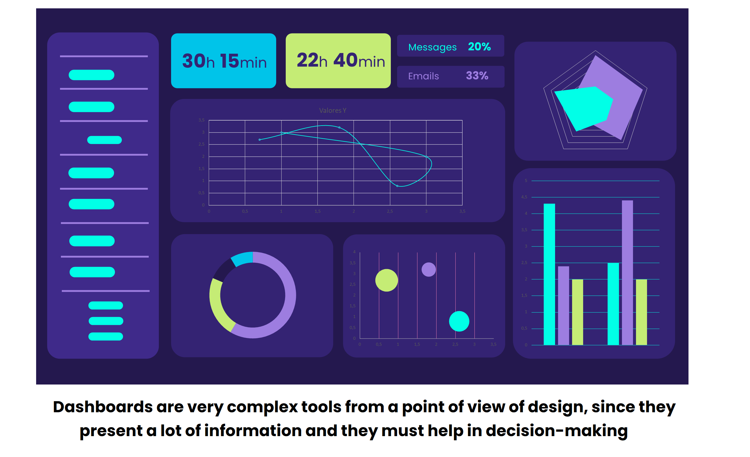
Designing effective dashboards is a challenge that combines the science of data visualisation and user experience. These tools are genuine troves of information, and to make the most of their potential, we need to follow a set of key practices.
Data are the currency of the 21st century, and they are essential to those involved in understanding and anticipating needs, assessing the state of their organisations or taking strategic decisions. However, data on their own can be overwhelming. Here is where the visualisation of data gains importance. It is a powerful tool that translates complex information in a clear and concise way.
The role of charts. How to choose the suitable one
Charts are the universal language of data visualisation. They visually represent numerical information and bring data to life. However, not all charts are the same. Each type of chart has its own personality, including unique strengths and weaknesses. Selecting the suitable chart is essential for the success of your dashboard.
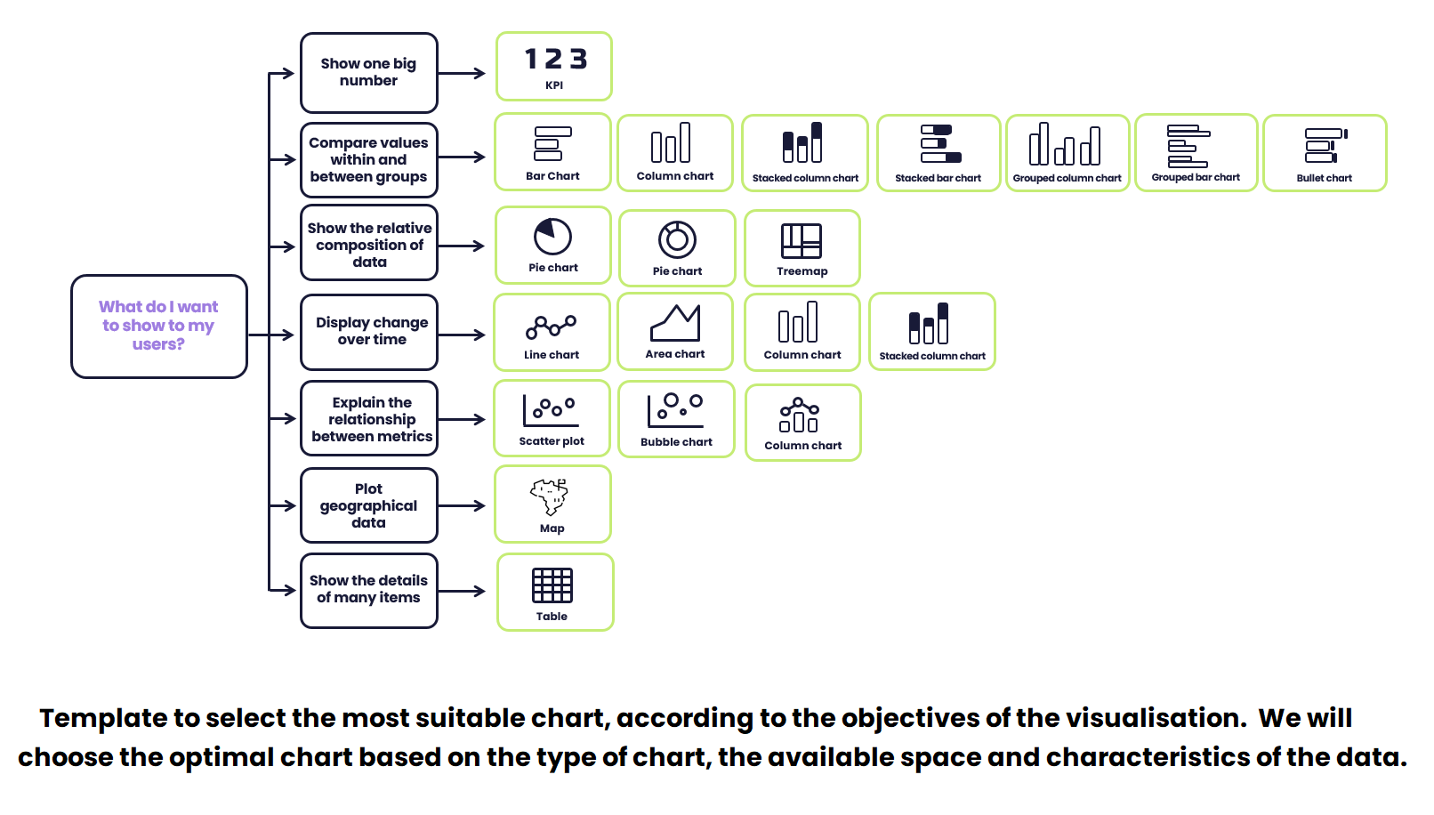
The starting point of choosing the suitable chart are your objectives. What do you want to achieve with your visualisation of data? If you need to compare values, bar charts are ideal. Each chart has its own place and purpose, and selecting the correct one depends on the characteristics of your data and your objectives.

Types of visualisation objectives: chooses the correct one for your message
When it comes to visualisation of data, choosing the suitable objective is like choosing the perfect tone for a masterpiece. Every type of visualisation has its own purpose, and understanding which adapts better to your message is key to effectively transmitting information.
Below are some of the key types of visualisation objectives:
1. Comparative: see the differences
The comparative objective focuses on comparing two or more values within a set of data. It is like having a magnifying glass to examine the differences and similarities between elements. If you want to emphasise the variations, this type of visualisation is your ally.
2. Parts of a whole: understand proportions
This objective is essential when you need to show the proportion of parts of a whole. It is ideal to illustrate how data is divided into categories and their magnitude in relation to the entire set of data.
3. Evolution over time: time travelling
Data are dynamic and the objective of evolution over time allows representing how data change over time. Whether it is to follow a trend or analyse a historical series, this visualisation is your compass.
4. Geographical arrangement: location matters
When the location is a key part of your message, the geographical arrangement is the right choice. This visualisation emphasises the details in a spatial context, providing a unique perspective.
5. Isolated KPIs: single focus points
Isolated KPIs are like lighthouses in the midst of information. They are employed to highlight singular values in headings or sections of the visualisation, where singularity is essential.
6. Relationships: linking data
Relationships are crucial when the links between data are essential for their understanding. This visualisation emphasises the connections and relationships, revealing the story behind the numbers.
How to choose the suitable chart
When creating financial dashboards at CaixaBank, chart selection is a precise process. Every selection is carefully related to the type of data, the quantity thereof and the purpose of the visualisation. For example, bar charts are usually chosen to represent discrete quantitative data, whereas line charts are ideal for continuous quantitative data. But the decision does not end there; the quantity of data and the visualisation objective also influence the selection.

Selecting the suitable chart is an art in itself. Every choice depends on a series of key factors:
1. Type of data and quantity
The nature of the data and their quantity are crucial factors. Bar charts are a solid option for discrete quantitative data, whereas continuous quantitative data are better represented in line charts. If there is an abundant quantity of data, using more complex charts, such as a scatter plot or an area chart, may be required.
2. The visualisation objective
Every chart has a specific purpose. To compare sets of data, bar charts or line charts are effective. To show parts of a whole, pie charts or staked bar charts are ideal. If what you are seeking is the evolution of data over time, line charts and bar charts stand out.
3. Visual coherence
Maintaining visual coherence is crucial for the dashboard to be effective. The colours, scales and labels must be consistent in order to avoid confusion.
4. Available space
Space is a limited resource. The charts’ layout must be efficient and effective, without overwhelming the user.
5. Interactivity
In the digital world, interactivity is a valuable tool. The designers must consider how the users will interact with the charts.
Tips for effectively designing dashboards
You have chosen the ideal dashboard. Here are some tips!
- Not all data needs to be displayed: Just the exact amount of information, that is, that which meets a need or helps answer a question required for our day-to-day. Always keep your dashboard’s objectives in mind.
- Communicate one message/idea per chart: This does not clash with each chart offering alternative views (based on the needs or experience of users that are consumers of the information), but you must avoid double axis charts (except when the relationship between both variables is very obvious), as they can make it more difficult to interpret the information.
- Take into account the context: In what situations does the user use a certain dashboard? Do they need to make decisions quickly? Are they under pressure when processing the information? In that case, you must simplify your dashboard by displaying the most relevant information and trying to reduce the users’ cognitive load as much as possible.
tags:
share:


